Sales for AirAsia Travelmall Duty-Free Web Shop
How can we improve the duty-free shopping experience on Travellmall to improve conversion rates?
UX Audit and Recommendations
(6 Nov - 6 Dec)
Client: AirAsia Group (Malaysia)
Role: Team Lead
AirAsia Travelmall Audit
-
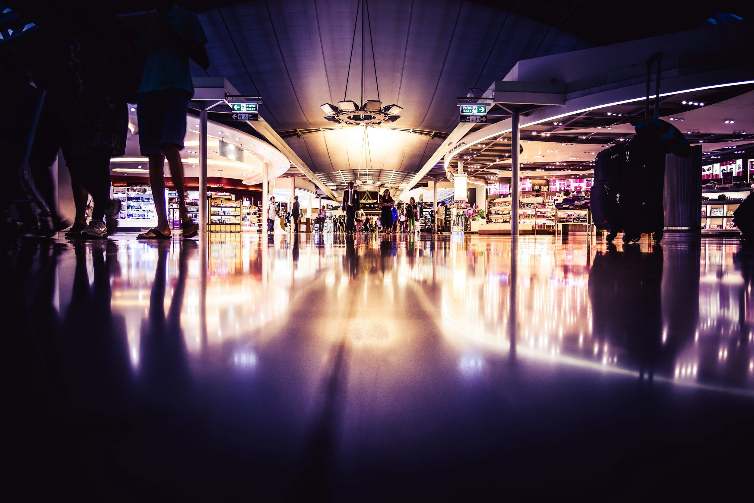
Travelmall has had low traffic and low conversion rates and the team was tasked to investigate.

-
Internally, stakeholder interviews, design iterations and attempts to improve information architecture had not yielded results.

-
Our role was to evaluate users’ pain points and design solutions to address them.

Research Focus: User Expectations vs User Experience
-
As we were unfamiliar with the product and market, our research focused on user motivations and the competitive landscape through a broad range of methods, to gain a thorough understanding in a short span of time to give sound recommendations.
-
Based on what AirAsia shared, we explored how their main competitors (KingPower, ishopChangi and Sephora ) compared in terms of product offerings, target audience, unique value proposition and web & app user flow design to emulate their success.
-
Thorough analysis and evaluation of the existing site was conducted based on Jakob Nielsen’s 10 Usability Heuristics, to guide our clients to step-by-step to improve the basics.
-
We conducted survey & interviews to learn about users’ expectations & habits around duty-free shopping online and where AirAsia could match them.
-
Live walk-through sessions were conducted to discover how users interacted the website, as well as their impressions and opinions.
Key Insights
Expectations vs Experience
💖🍷💄Duty-free shoppers expect cosmetics, alcohol and limited edition items to be available, citing these as the top products they look for
🛒➡️🚫Difficulties with searching for items and interrupted user flow before adding to cart
✅🪙💎Duty-free sites expected to have authentic and legitimate products, and a broader range of travel-exclusive products
❌❓🚧Often, “no products available” was shown when navigating site - products seemed limited and users said the UI did not feel trustworthy due to navigation issues
ℹ️🏠🛬Users expected more information about different delivery methods (home delivery, airport collection or in-flight collection)
😕📦❓Collection methods were confusing and users had many questions about them
😕🎁❓Promotions were displayed prominently and desirable, but users had difficulty finding items due to site organisation
🎁🥰Most expect duty-free to mean lower prices, more convenience and special items suitable for gifting

Before
Users went through multiple loops before being able to add anything to cart
Issues of many products not available once a user toggled to a different delivery method
Difficulty searching for products as the categories were too narrow
Website described as not appealing and difficult to trust from user feedback
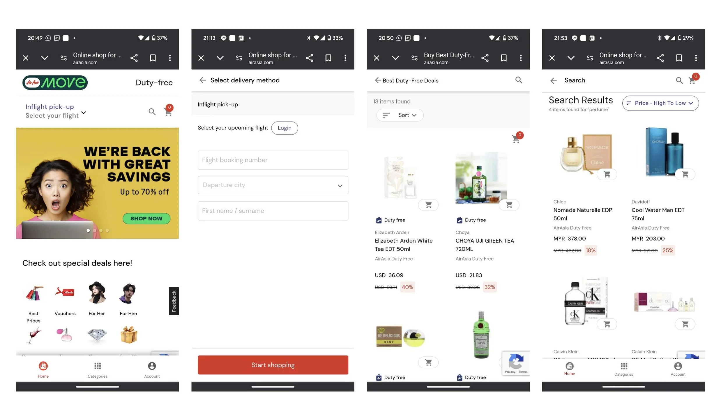
After
AirAsia has since made a number of updates to their site
Removed option for airport delivery and focused on in-flight delivery
Product listings improved to highlight available products and promotions
Search and categorisation functionality improved, highlighting branded cosmetics/perfumes and alcohol
Rebranded to AirAsia MOVE